Overview

Project Description:

The Department of Food, Bioprocessing, and Nutrition Sciences (FBNS) at North Carolina State University needed to redesign the outdated department website in a way that attracts prospective students to the program, serves the current student population, and provides relevant information to university partners.

Goal:

  • Identify opportunities to consolidate information and redundancies for current students

  • Clearly define services the FBNS offers

  • Promote the FBNS to prospective students

My Role:

UX Researcher

To facilitate the redesign efforts FBNS formed a website redesign committee. The purpose of the first committee meeting was to define  department objectives and suggest changes. In preparation for the meeting, I sketched out a user case study that  demonstrated aspects of the website we might want to improve. The user storyboard revealed that there is missing information and broken links.

Storyboarding

Website Map

Wireframe

The quote below demonstrats the positive feedback  I received  after showing my approach to use User Experience design.

Elena. This is a fantastically detailed use case. Love it. Thanks for this valuable contribution.
— Julie Yamamoto, Project Coordinator | Instructional Designer NC State University Food, Bioprocessing, and Nutrition Sciences

Below is the current website home page.

websitemocup.jpg

Stakeholders Interview

I thought the current website was very difficult to use but I did not assume that every student in the department felt the same way as I did. I began this project by interviewing some graduate students.  I wanted to get answers to two questions.

1. Do students use the website at all?

2.  What are the reasons students visit the website?


Survey

After my initial interviews, I made a five question survey to validate the information after the interviews.The survey began with a screener question that helped to focus on the desired population. I confirmed that this project was worth investing time in because I received many emails from students who were excited about possible improvements.


Analysis

I analyzed the data from the survey, the results are below.

The top reasons students use the website

The following are results from the graduate students

How often do you use the website?

This represents the data from all of those who took the survey.

Usability Testing

To further understand the problem areas of the website I conducted moderated interviews with 4 participants. Each participant was given a hypothetical scenario and asked to perform a given set of tasks.


I visited the websites of three other universities  that are  known for their food science programs, Colorado State University, University of Califronia Davis. and Penn State University. I looked for features that the students from our department wanted to have on our website.

pennstate.jpg

Penn State

- A clear checklist for graduate requirements.

 Course requirements are very easy to find.


ucdavis.jpg

UC Davis

- Courses and the descriptions are really easy to find.

 Clear descriptions of courses. Many photos.

colorado.jpg

Colorado State University - A clear checklist for graduate requirements. Easy to find the information about different professors.

Persona

I used the data from the interviews and from the survey to create one persona, Steve. Keeping him in  mind helped me make informed decisions about solving his needs.

summer-office-student-work.jpg

Steve

Residence : Raleigh, NC

Occupation: Graduate Student

Bio:

Steve is a second year non-thesis masters Food Science student. He is very active in the department.  He is a member of the Nutrition Club and the Food Science Club.  He works for the sensory analysis lab  and he is a  teaching assistant. 

Goals:

- Graduate one semester earlier.

- Find out about research opportunities on campus.

Frustrations:

- He couldn't find course requirements online and had to go talk to the secretary.

- When he attempted to contact the professor that he is going to be working with , he couldn't find his contact information on the website.

As Is Scenarios

The current search for course requirements does not solve the users needs.  I created a storyboard to represent the current process. The search takes about nine steps before the user gives up and calls the secretary.

asisfor requirements - Page 1.jpeg


Finding a contact was another process that took many steps.

asisfor contacts - Page 1.jpeg

Recommendations

  1. Consider adding a “Services” tab to the top-level navigation.

  2. Add a separate “Assistantship” page under “Academic Programs”

  3. Add a link to the “Food Safety Manager Certification” page under “Academic Programs”

  4. Add the upcoming club meetings to the “Events' & Calendar” page to help prospective students discover various clubs

To Be Scenarios

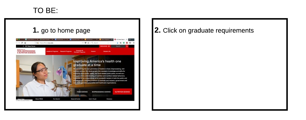
The new layout solves Steve's needs. 

It gives him a one step solution to find the graduate requirements. 

to be scenario for requirements - Page 1.jpeg

One step solution to find contacts.

to be scenario for contact - Page 1.jpeg


 Site Map.

Graduate Requirements

Current Site (As Is)

Proposed Design (To Be)

Contact information

Current Site (As Is)

Proposed Design  (To Be)

future flow to find a professor - Page 1.jpeg


Future Work

Interview other stakeholders.  Test out the proposed new design. Change the front page according to the input from the students.